Go Mobile
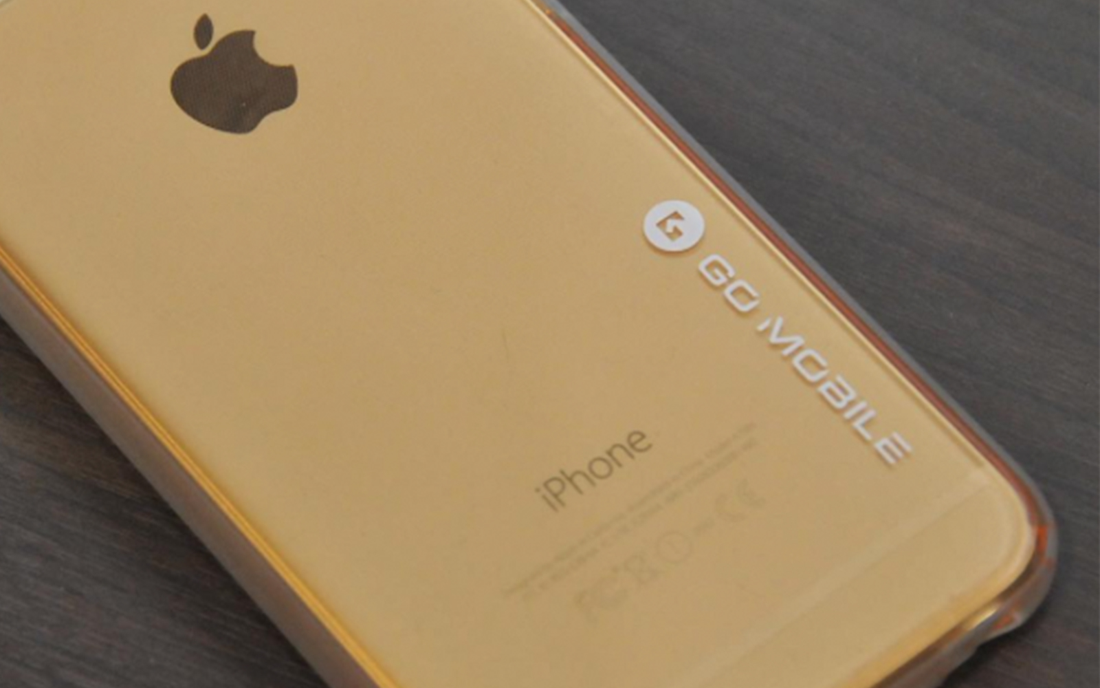
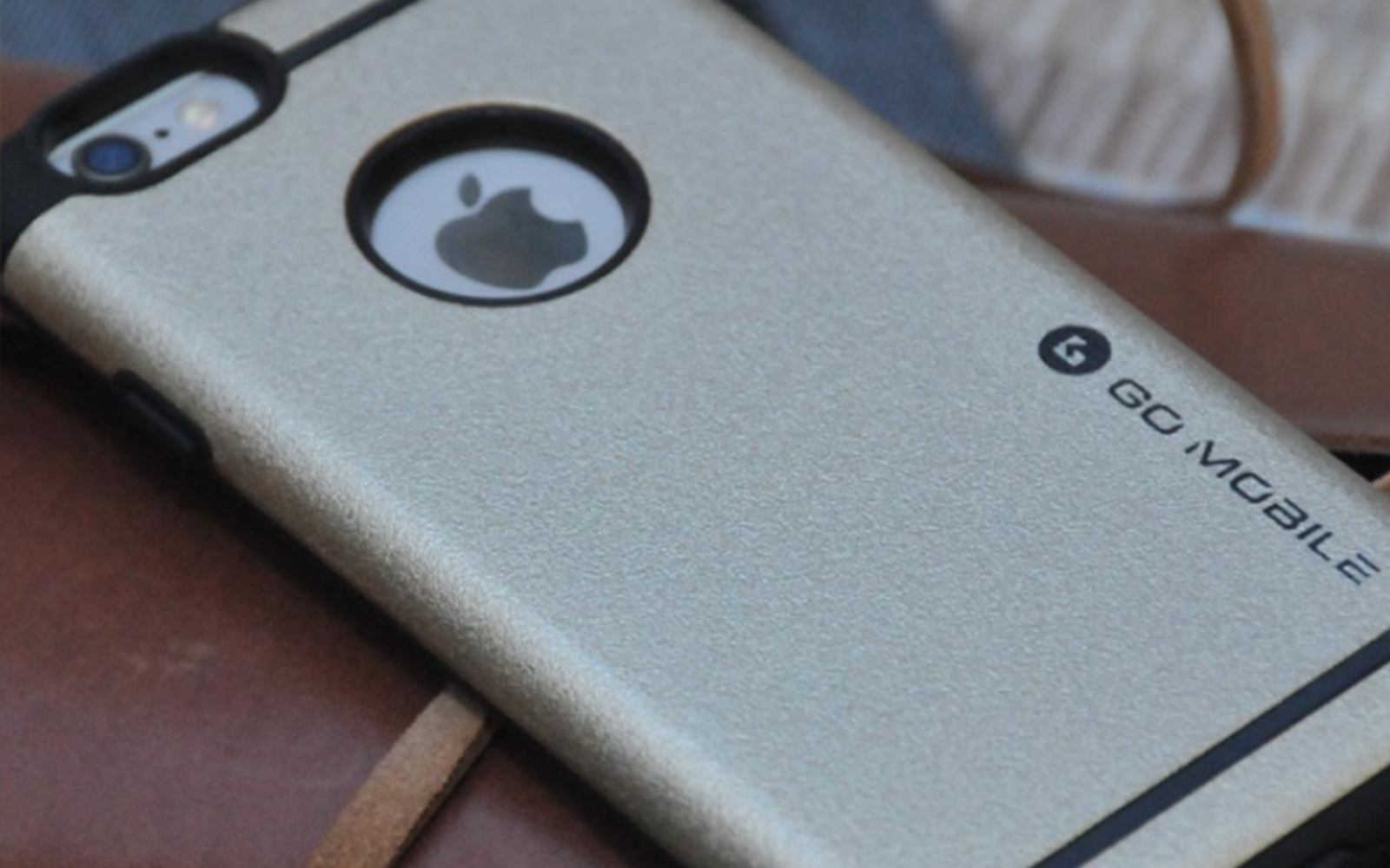
For a company which specializes in innovative mobile phone cases, I designed a logo based on their brand name “Go”. To visualize movement, the logo forms the letter G composed of triangle arrows with a visible arrow in the middle. The arrows are going in different directions encapsulated in a circle to pay homage to the fast-paced industry of technology. To reflect the industry, the style and treatment is reminiscent of techie startups and developments.
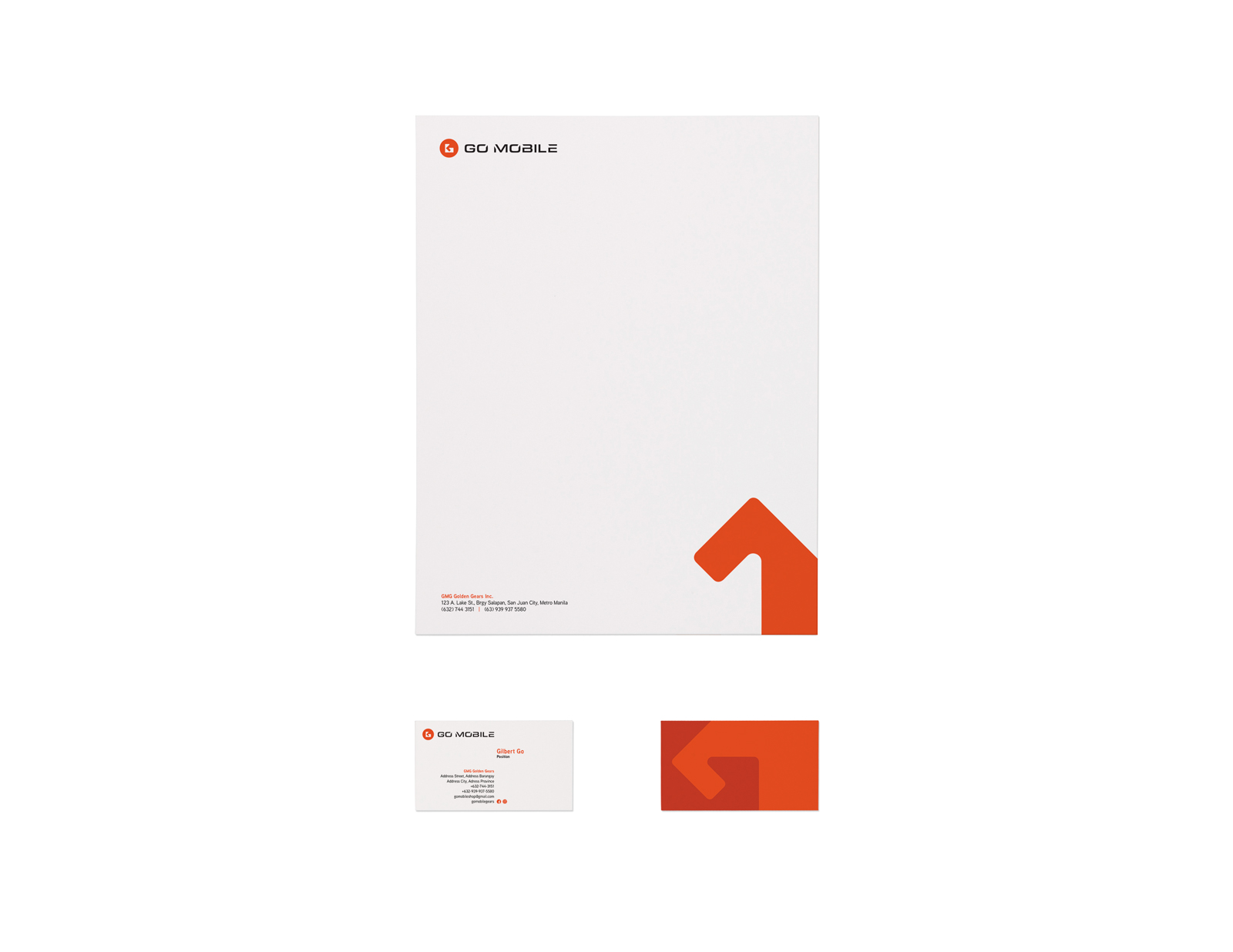
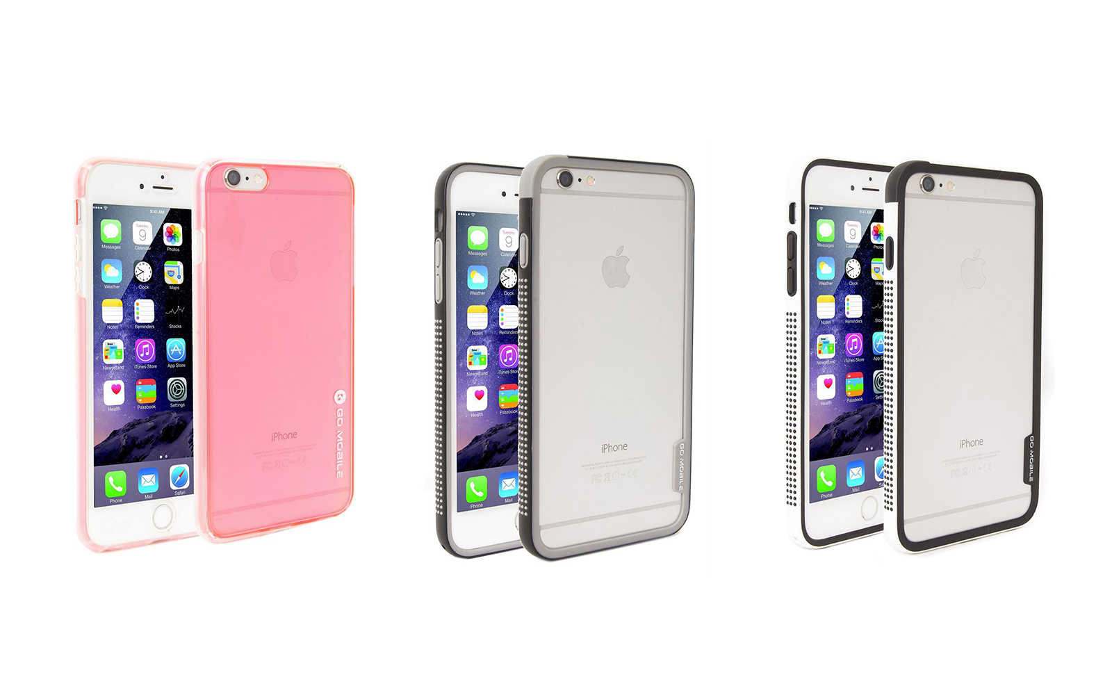
I designed the logo and the company’s marketing collaterals in the form of an identity system which include the business card, letterhead, and packaging design. The color orange is chosen to visualize energy, while the typography used is deliberately hi-tech inspired to complement the icon.
